There are a couple of things that are important to me while designing and styling level layouts and scenes. In my approach to level design, there are four main pillars: context, accents, flow and exploration.
What follows is an extensive explanation of each pillar. Most of the examples will refer back to Heim, as I can claim all of its level design as my own. That means you’ll see my application of the four pillars in practice.
CONTEXT
The context of a level should be the starting point of coming up with interesting level ideas and their design. Does this environment suit the gameplay? If you are designing a map for an action game, try to minimize dead ends: there should always be two points of access to any given place on the map. This means players can’t camp out and eliminate enemies as they approach, but it also means they have at least one escape route if things don’t go their way.
Heim is a puzzle adventure game, so its levels don’t need to take combat situations into account. The areas of the game where platforming is more of a focus should allow for fun platforming mechanics and not be too frustrating to traverse. If something can go wrong in the gameplay, it should always be avoidable too. Even if that means that the player needs to perform perfectly to avoid taking damage – the possibility should at least be there.
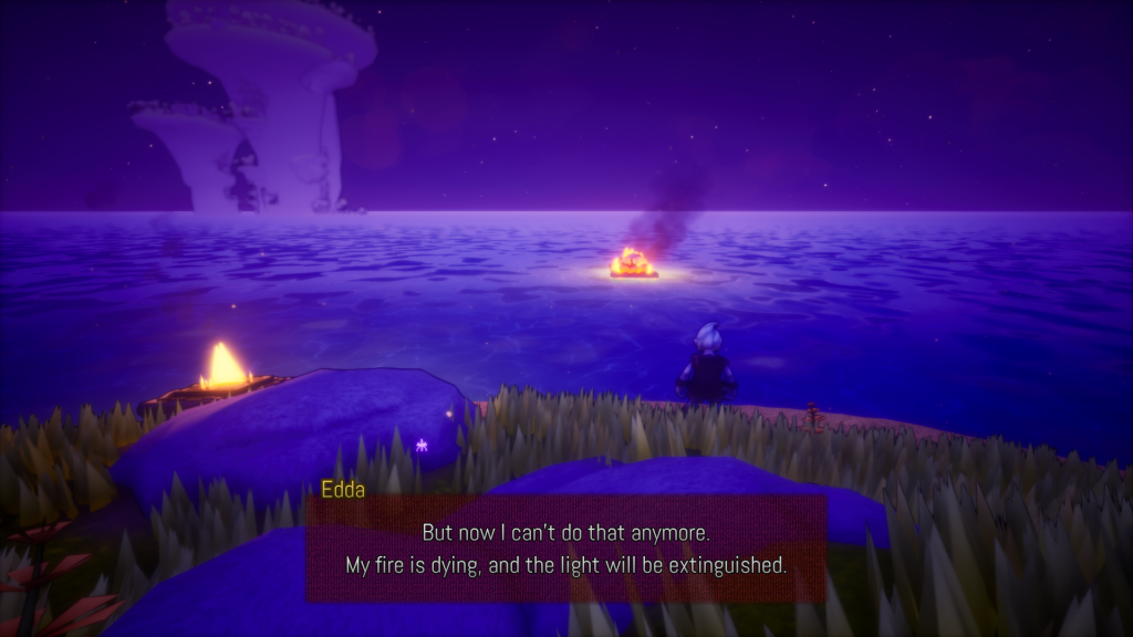
Context comes in many forms, like the target audience. A kid’s game shouldn’t be depicting bloodbaths. Heim is a game for all ages, sort of like The Legend of Zelda series. Deaths may occur, but are never depicted with realistic violence. Smart cinematography and dialog can imply a death without even having to show any of it. Sometimes that means a sound, sometimes a fixed camera angle.
ACCENTS
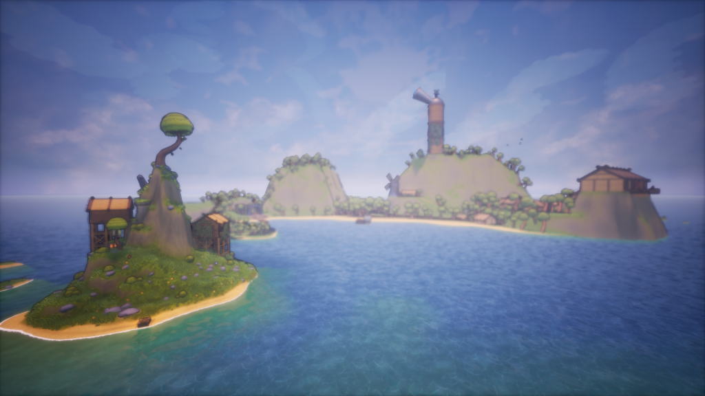
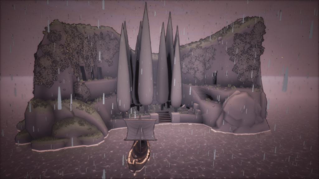
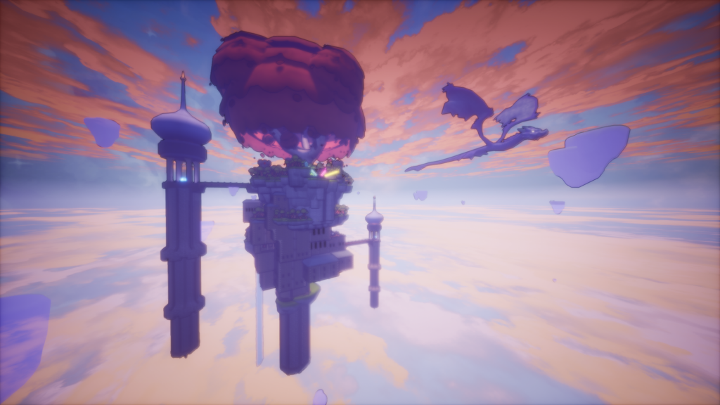
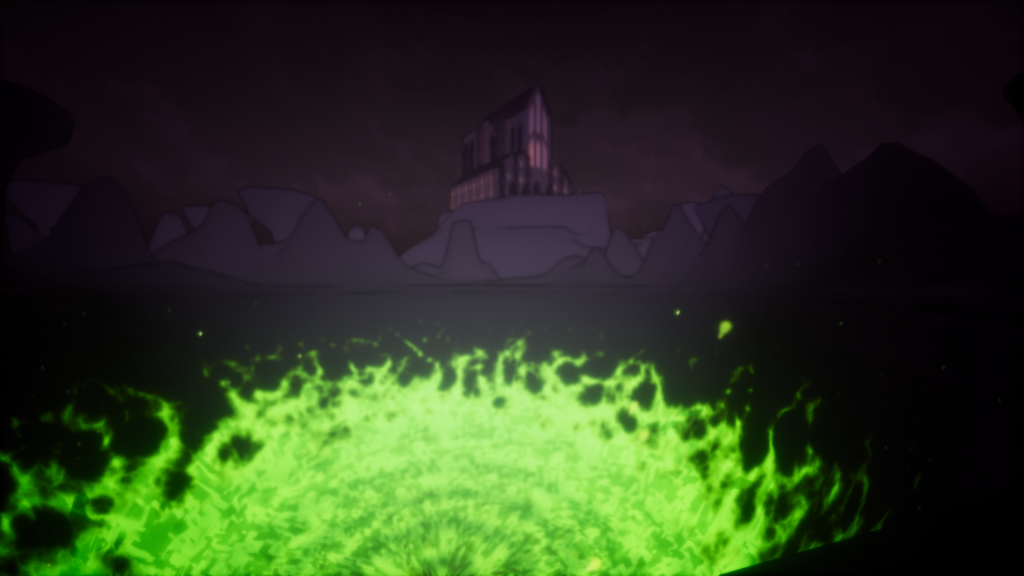
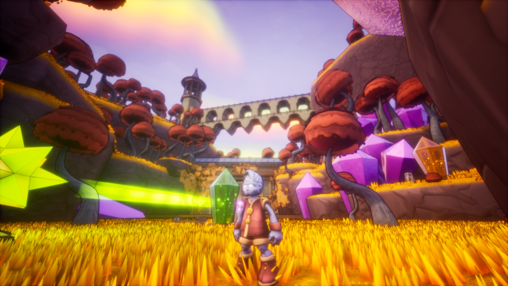
I also value the inclusion of accents. This doesn’t mean every place needs a regional dialect, but that the environment should have some unique properties, points of interests and landmarks. A quiet island village can become a lot more memorable by adding an observatory. Maybe it should be raining on the dreary isle of the dead. Loftseid Watch has a giant tree at its midst, and a flying serpent circling it. The Realm of the gods is not just another forest world, but has golden grasses, red tree leaves, a shimmering aurora and crystals to set it apart. Even amongst the dark mists of the underworld, you can see a tall building way up high in the distance, and a glowing green pit in front of you. Something to break up the monotony.
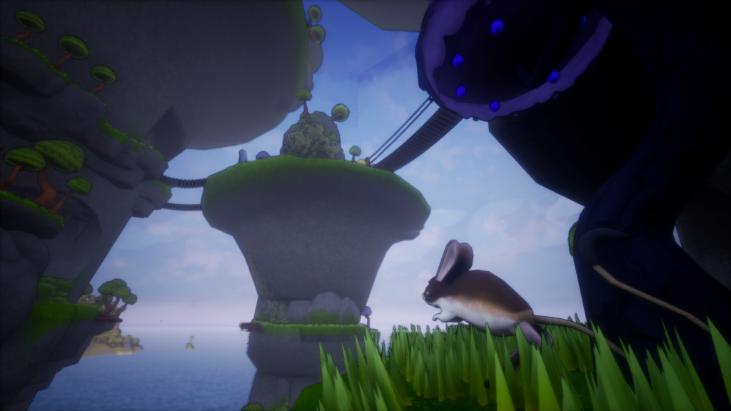
In the prototyping stage of Heim, Svaldagr used to be just another island – I decided to transform it into three tall rocky pillars with a lush natural environment. You have to make your way up the winding pillars to the highest peak, and can do so with the help of some cute hopping creatures. All features that make this location more iconic.
FLOW
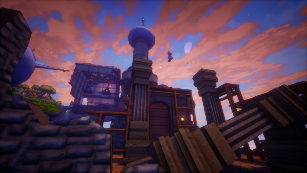
Flow is one of those words that can mean a thousand things. In this case, I’m talking about the ease with which the player can traverse the level, both physically and visually. The way you move is important to take into account when designing a level. How fast can the player run? How high can they jump? Not every jump needs to be a jumping puzzle: sometimes small hops will do just fine. I try to avoid too many abrupt edges and dead ends. Having to backtrack along the same way you came in can be a little boring. One-way shortcuts after completing a puzzle will feel a lot more satisfying, and will make your level feel more connected. Perhaps you can activate a mechanism to make the next trip a lot quicker.
Besides the player’s own movements through the level, consider how the camera and the player’s eyes may move through a level. When you reach a new location in Heim, you first get an establishing shot of the area before you can even begin moving. It’s just a few seconds, but it helps the player to look at the environment before they rush into it blindly. It may even point out some interesting prospects the player may want to visit. In a shooter or a stealth game, the player might have to move from cover to cover, seeking out the next space where they can seek refuge from enemy eyes. In some cases, you want the player to take a certain route: the goal of the level designer is to make it clear which parts are inaccessible, and which parts are the way to go. It can be something as simple as removing knobs from doors, or making an impenetrable window opaque and more reflective than a breakable one.
EXPLORATION
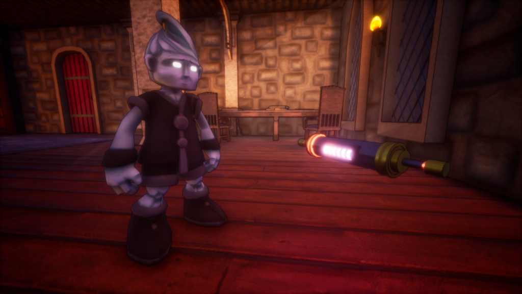
And finally, there is the importance of rewarding exploration. Even the most beautiful of games won’t inspire the player to explore the scenery if going out of your way to do so isn’t rewarded in a tangible manner. Collectibles are, in my opinion, the heart of exploration. What a collectible is, however, can mean a wide array of things. It can be a coin or a rupee, materials or weapons; it can even mean secret areas, bosses, quests or achievements. A collectible can be anything you can check off a list.
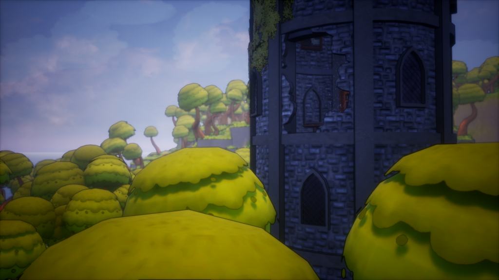
A hole in a tower may require you to jump from tree to tree to find out what’s inside. Reward the player for thinking outside of the box and doing more than the bare minimum to get through the game. They may come across an NPC off the beaten path that can give them useful information about the area, or find a legendary blade hidden behind a waterfall. Some games even hide entire optional areas in places few would think to look.
IN SHORT…
That concludes this look into how I approach level design. The mission statement is four-fold:
- Consider the game’s context.
- Break the monotony with interesting sights.
- Avoid frustration, adapt to the gameplay.
- Reward exploration with collectibles!
These design pillars came into being through the simple act of viewing games through the lens of a game designer, as well as trial and error in realizing my own games. I invite you to try to look at games you play as if you had to recreate them – I believe there is much to learn this way.

